Clear
Clear is exciting. It pushes the boundaries of how we think software interfaces work and is full to the brim with delightful interactions. Below are some thoughts on the app. I’ll also refer to Portmanteau’s Listary for comparison.
Navigation
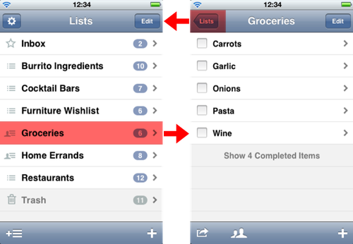
Standard iPhone parent-child view navigation employs a spatial model that arranges views left-to-right; lower levels move in from the right side of the screen. This spatial model and the means of navigating are unrelated: nothing about tapping a list item suggests moving to the right. The back button implies a direction, but is just tapped. Listary uses this standard navigation design.
Clear has a fresh take on parent-child navigation. Interestingly there are two ways to navigate, with conflicting spatial models.
One model shows views stacked in the ‘z’ direction, with lower levels presented by spreading out the current view to show the child underneath. Going back up is done by pinching to collapse the child view — an action that matches the spatial model. This feels like the preferred way to navigate in Clear; it’s what is shown in the product video.
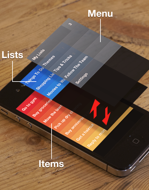
The other way to go up a level is to pull down, as if the views are stacked vertically (in the ‘y’ direction). The spatial model and user input match perfectly. This child-to-parent transition exists to enable full navigation with one finger. The reverse transition — pushing up to go to the last used child view — conveniently undoes going up.
The matching of input with on-screen movement and the spatial model is what makes Clear feel a little magical. Tracking finger movement in real-time is so important. Apple’s navigation bar feels dull by comparison.
However, I almost always use my iPhone in one hand, so two finger actions are inconvenient. Jason Kottke wrote about the importance of single-handed operation of the iPhone in 2009. When using Clear, I always drill down by tapping an item (which uses the ‘z’ spatial model), and go back up by pulling (the ‘y’ model). This combined spatial model is nonsensical.
This is all very theoretical. Is it a usability problem? I don’t know. When using Clear I have a sensation of always moving up but I never end up anywhere different, which bothers me. Shouldn’t software leverage humans’ excellence at spatial thinking? There’s not much point in having a spatial model if it doesn’t make sense.
Modes, and other interface problems
The action of pulling down on a list is overloaded: it can either create a new item or go up a level — depending on how far you pull. Regarding this, Lex Friedman said in his Macworld review:
It’s kind of a crapshoot, and you can expect to make the wrong thing happen with alarming consistency.
This was my experience too. The problem is that after trying to go up and not pulling far enough, you’re stuck in a mode. Trying to escape by repeating the pull down action doesn’t work. Instead you must dismiss the keyboard, then try again.
Invisible tap targets are another problem. “Make things visible” is one of Don Norman’s four “principles of design for understandability and usability” in The design of everyday things, but Clear doesn’t do well here. Lex Friedman again:
Tap on a list’s name, and you don’t go to that list, you start editing its title. Instead you need to tap on the much smaller tap target—the number of incomplete items on that list, or any blank space after the list’s name before that number appears.
When I was first using Clear, I accidentally tapped the name every single time! Of course I always want to view a list and never want to change its name. Frustratingly, it again takes two actions to recover: tap once to exit the editing mode and again to finally get where you wanted to be.
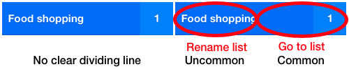
So each cell has two tap targets, with no clear visible separation; the target sizes aren’t proportional to how common their action is; and it is not as easy as it could be to recover from frequent ‘mistakes’.
The emphasis on being able to edit items is also present inside a list. I very rarely want to edit an existing item, so it’s odd that the primary action (tapping) is for editing and swiping is used for marking items as done. This was annoying in the supermarket. As I walked the aisles, I would accidentally tap items instead of swiping, which then requires dismissing the keyboard and trying the swipe again.
Data lock-in
Listary works fantastically with the clipboard. You can copy entire lists, and paste in blocks of text (each line becomes a list item). Michael Schechter wrote about Listary and Clear, and prefers Listary because of the paste feature.
Since Clear does not have these features, it was harder to try the app out. I wanted to move my lists over from Listary, but instead I had to tediously recreate them. And I don’t feel inclined to put long lists in Clear, because I will not be able to conveniently get them out. This brings to mind Joel Spolsky’s Strategy Letter III — not being able to get stuff out of an application is a barrier to entry.
Listary syncs with Simplenote. I occasionally make use of this to access my lists in Notational Velocity, but I could cope without this feature. Data liberation via the system clipboard is more important to me than syncing.
Colours
From what I’ve seen, only the Heat Map theme makes the list of lists a different colour from lists themselves. I like having this distinction, so that I better know where I am in the app.
I don’t buy into the whole ‘heat map is the priority’ thing. Order might show priority if I decide to use it like that, but the feature of the app that enables this is reordering.
On a practical note, checked items are way too dark. I can’t read them in brightly lit environments, such as in the supermarket or by a window. My desk is by a window.
Arrogant design
Some aspects of Clear come across as arrogant. Specifically, the hiding of the status bar and the twenty-eight character limit on items. The good news is that both of these problems were addressed in the 1.1 update, although the length of list names is still limited.
The sound when trying to enter more characters says that you, the user, are doing it wrong. Whatever well-meaning motivation may have been behind this decision, the result was that I was forced to spend time thinking how to truncate what I wanted to jot down, perhaps by removing spaces or vowels. I had to adjust to suit the app’s desires — and still do for list names.
Marketing
Clear is marketed as a ‘productivity’ app for keeping ‘todo lists’. This is surely responsible for the demand for features such as due dates and alerts, which make sense in the context of a task management application. But that isn’t what Clear is; it’s an app for making lists. I rather like how Portmanteau are unassuming about how you’ll use Listary. They say it’s an app for making lists: lists of anything you want.
Christopher Jones wrote a review of Clear, and lack of due dates is his main complaint. The problem is framing. There are many uses for a lists app without dates, and it’s reasonable to have a separate tool that can remind you of time-critical tasks. Clear’s marketing screen shots show three lists: “Things To Do”, “Shopping List” and “Movies to Watch”. For me, these lists apps work best with lists similar to the latter two.
Conclusions
Clear is off to a great start, and the improvements in 1.1 are in the right direction. It introduces us to two new navigation design patterns, which have advantages and disadvantages over Apple navigation bar. I don’t like getting stuck in modes, or having my data stuck in the app.
Clear shows us new ways that software interfaces can work. I look forward to seeing where it goes in the future, but also how ideas from Clear trickle into other apps — particularly Listary.