Some Thoughts on the Instapaper App’s Interface
The Instapaper iOS app’s interface is pretty good already, but I felt like doing some designing so here are some thoughts I had. I’m not creating this post because it’s important, but because it’s fun. Term has just finished, so I have free time right now.
Problems
- The Share panel contains actions that are not related to sharing.
- The Share panel is clunky and does not scale very well as more actions are added.
- Moving an article to a folder or accessing an option in the Share panel takes three taps.
- Print is placed in different locations on iPhone/iPod Touch and on the iPad. (Instapaper Blog)
- The Star toggle feels too prominent, while Archive is not prominent enough.
A simple fix for problem 1 would be to rename the Share panel to something like the ‘Actions panel’ or ‘More’. This isn't a very interesting problem. In this post, I shall call it the Share panel for simplicity.
Archive, Star and Move to Folder
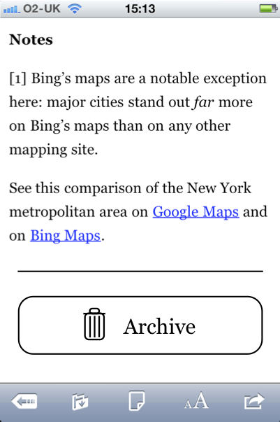
Let’s look at archiving first. This relates to problem 5. I usually archive articles when I’ve read to the end. I would guess this is fairly common. The current interface shows a useless ‘Back to Instapaper’ link: useless because there is a back button already — in the toolbar on iPhone and the navigation bar on iPad. An ‘Archive’ button would be useful here since, otherwise, archiving requires two taps. This is a contextual interface: the button shows up just where you are likely to need it.
As you can see, I replaced the Star button in the toolbar. The new button is ‘Move to Folder’ (icon taken from Mail). As stated, I think the Star button is too prominent. There are two problems: sometimes I star articles by accident, and I don’t dish out stars generously enough to justify Star precious toolbar space.

Tapping the ‘Move to Folder’ button would bring up a modal view inspired by Mail. An always available Archive button has been placed here. This is for when you give up before reaching the end of an article. Star is also here, so it hasn't moved far from its old position. (It is actually in the same position on screen.)
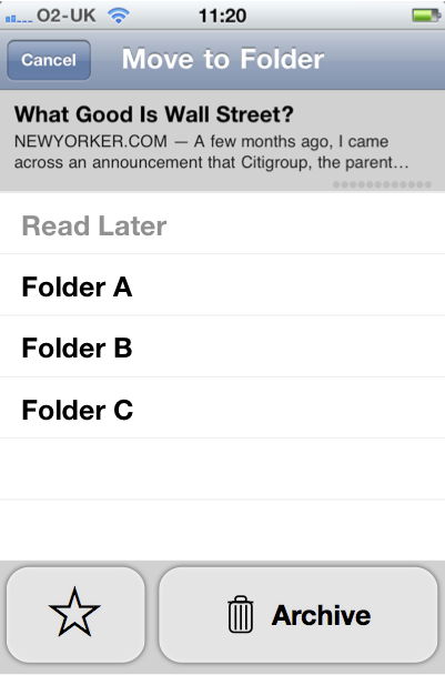
This layout means that articles can be moved to different folders in just two taps. Archive is always available in two, just like before, but a single tap is all that is necessary in the common case. Star would take two taps (one more than the existing design), but I have justified this. I put in a banner showing the current article, which is a reminder of context. People who have a lot of folders would probably find this banner an unnecessary screen space hog. The same applies to the article’s current folder, which is shown greyed out and is again designed to show context. The title of this view is weird, as starring an article isn't moving it to a folder. Archiving fits in though, as the archive is a folder.
This layout can be applied fairly easily to the iPad. The Star and Archive buttons could be replaced with a ‘Move to Folder’ button. Tapping this could open a popover similar to the modal view shown above. I’d put the Star and Archive buttons above the folder list and remove the banner showing the current article.

Two possible modifications to this:
- Show Star next to the ‘Move to Folder’ button, not in the popover. This is more logical.

- Show Archive next to the ‘Move to Folder’ button, not in the popover. This better prioritises more common actions.

Actions and Sharing
Now we’ll move on to the action (swoosh arrow) button. Since, Archive and Move to Folder have been dealt with elsewhere, these no longer need to be available from the action sheet.

If Open in Browser/Safari and Print (on iPad) were moved to the Share panel, there would be nothing left in the action sheet except ‘Share…’. Therefore, the action button could show the Share panel immediately. (Print is already in the Share panel on iPhone/iPod Touch.)
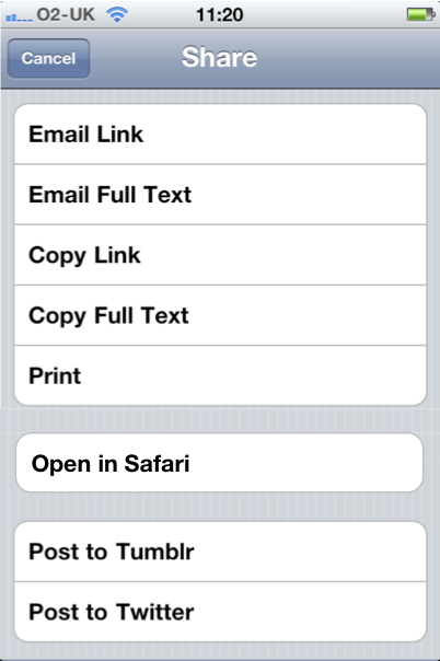
Actions in the Share panel are now available in two taps rather than three. Open in Browser/Safari is equally accessible.
The problem with this is that the Share panel is not very scalable in its current form, and it just feels clunky — as stated in problem 2. (This is partly due to a quirk in the implementation: the rows in the Share panel do not highlight blue when touched. This lack of feedback results in a poor experience.) It looks like Silvio Rizzi came across this scalability problem when designing Reeder. Reeder’s Services Panel displays a two dimensional array of buttons rather than a list. This could work in Instapaper as well. Something like this:
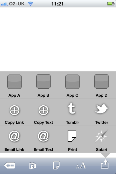
This is essentially a popover so should feel right at home on the iPad.
One more thing: the Share panel is also available from the selected text menu (next to Copy and Define). This could be renamed to something more appropriate, as discussed at the start, and tapping it could show also a grid. Actions that relate to the whole article (such as Copy Full Text) or its URL (such as Open in Safari) would be removed.
I have doubts about the ideas I have described. For example, the use of custom interface elements is bothering. Also, I’ve made fancy mockups but these are certainly premature thoughts. I made the mockups because I didn't want to publish my rough pencil sketches, even though they’d give a better indication of how far developed this design is.