Tab Bar in the iPhone Photos App
Background
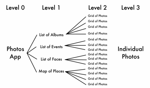
With iOS 4 on iPhone and iPod Touch, Apple added Faces and Places to the Photos app. This was done by adding a tab bar to switch between sections. I believe the hierarchy of the application looks something like this:
I apologise for the diagram not being published as a scalable vector graphic. I don't know a convenient way to go about making and publishing such a format.
So I'm defining four ‘levels’. To repeat, it's like this:
- Photos App (0)
- Events (1)
- photos in an Event (2)
- a photo (3)
- photos in an Event (2)
- Events (1)
The tab bar deals with Navigation from Level 0, which means going between Level 1 items (choosing from Albums, Events, Faces or Places).
The Problem
This interface does not please me; it does not feel like the right choice of navigation control. The tab bar allows jumping between Level 1 items while browsing Level 2. I don't need to switch to Places while looking at photos in an Event, because I decided I wanted that Event. On all these screens, the tab bar is taking up space that could be used for more content. For me, the tab bar is visible too much.
I clearly like tab bars a lot less than Apple. There are very few tab bars using applications that I would also say I like the design of. I can only think of Clock and Phone.
There is a good reference for iPhone app design called the iOS Human Interface Guidelines. Heard of it? Here is what it has to say on tab bars:
A tab bar appears at the bottom edge of the screen and should be accessible from every location in the application.
I added the emphasis.
It is generally okay for the tab bar to be inaccessible from minor modes in the application. The tab bar in the Photos app is hidden when viewing photos, which is the most important — and common — mode of the app. I’m not suggesting showing the tab bar while viewing an individual photo. That would be awful. According to the rulebook, the tab bar is visible too little.
Looking for a better solution
There must be a better way to navigate between the top level sections of the Photos app.
I like applications that use only lists to navigate information in a hierarchy. These are technically called Table Views. Examples are Instapaper (Folders → Articles → an article) and Contacts (Groups → People → a person). This could work for the Photos app: we could have a back button on, for example, the list of Albums that goes back to a list containing ‘Albums’, ‘Events’, ‘Faces’ and ‘Places’. However, there are already three views in the app (for levels 1, 2 and 3). Adding a new top level view (for Level 0) puts this up to four. This might make Photos feel like a complex productivity app, which it certainly should not.
The difference between Photos and Instapaper/Contacts is that the number of items at Level 1 is fixed at four, rather than being unlimited. We could use an interface element optimised for showing a small number of categories, rather than the more general purpose and expandable list. This might suit:
Consider putting a segmented control in a navigation bar at the top level of an application. This is especially useful if doing so helps to flatten your information hierarchy and makes it easier for people to find what they’re looking for.
Perfect. This is from the section in the Human Interface Guidelines on navigation bars. The benefits are:
- A segmented control in the navigation bar takes no extra space on the screen. There is a significant saving compared to a tab bar.
- This keeps the hierarchy flatter.
- The navigation matches the hierarchy; switching top level sections is only allowed at the top level of the app.
- This keeps navigation where it belongs: in the navigation bar.
Oh, the Photos app on iPad works just like this: with a segmented control.
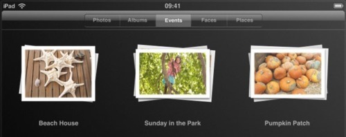
Image source: Apple
Why isn't the Photos app like this on iPhone and iPod Touch?
I can’t say for sure. I suspect it is to do with aesthetics and ease of implementation. The ‘small screen’ Photos app uses black translucent bars (status, navigation and toolbar). Segmented controls are not generally used on translucent navigation bars. I think the combination would not look good, or would at least need some tweaking to be acceptable. Alternatively, maybe most people find tab bars more agreeable that I do.