Improving iOS menus by putting icons on the left with swizzling
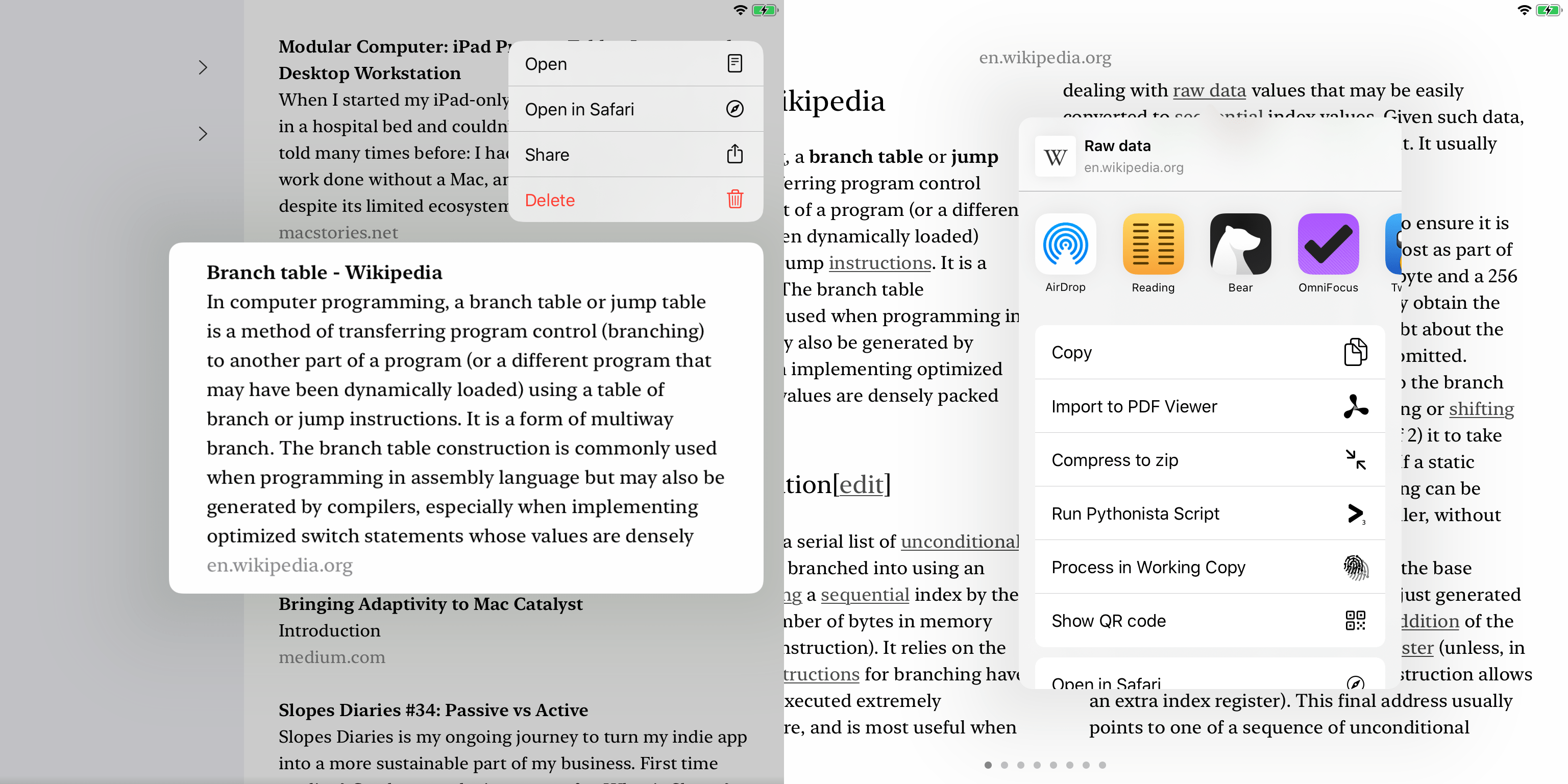
The arrangement of icons and text in the iOS 13 contextual menus and share sheet has drawbacks for usability. In this article, I’ll look at the layout principles involved and then go though how I implemented an improvement with some swizzling fun. The problem is these icons are way over on the right, far away from the corresponding text.
Alignment and spacing
I’m not the only one with doubts about layouts like this. I’ll start with quotations from four excellent sources. First, in The Elements of Typographic Style version 3.2, Robert Bringhurst writes in §2.1.10, Don’t stretch the space until it breaks:
Lists, such as content pages and recipes, are opportunities to build architectural structures in which the space between the elements both separates and binds. The two favorite ways of destroying such an opportunity are setting great chasms of space that the eye cannot leap without help from the hand, and setting unenlightening rows of dots […] that force the eye to walk the width of the page like a prisoner being escorted back to its cell.
Second, in Designing Interfaces, 2nd edition, Jenifer Tidwell discusses the Right/Left Alignment pattern in chapter 4. This focuses on forms that have text labels on the leading side and values on the trailing side. For menus with icons, the context is different but the principle is applicable.
When you put text right next to the thing it labels, you form a strong perceptual grouping of the pair — much more so than if they were separated by a large amount of space.
[This layout helps] form a nice strong double edge down the middle of the whole thing (taking advantage of continuity, another Gestalt principal). This powerful edge guides the viewer’s eyes smoothly down the page, supporting a good visual flow.
Third, here’s Federico Viticci talking about the iOS 13 share sheet on App Stories episode 128:
Transcript:
The second problem I have is that I believe the icon […] should be on the left side of the action’s title because right now my eyes have to go left to right: I have to read the name of an action and then I have to look at the glyph. Whereas I think it would be easier to visually scan — when you’re scanning though the vertical list of actions — it would be easier to have the icon and label right next to each other.
Saving the best until last, Luis Abreu has a fantastic post all about the iOS 13 contextual menus. It includes clear diagrams illustrating the extra work the eye needs to do, and covers several other menu usability issues (some of which were already resolved). You should read the whole thing, but here are a couple of relevant paragraphs:
Our eyes work best if they don’t need to move much when reading content. This is why when you look at the iOS (or Android) Settings app, icons are right next to where the text label starts, so you can quickly jump between them without moving your eyes too much.
With iOS 13, Contextual Menu actions display their icons on the opposite side of the text label. This means you can’t quickly jump between icons and text labels as you scan the list, without looking at completely opposite edges of the screen.
Implementing an improvement
Update: The view hierarchy changed and the technique described here unfortunately doesn’t work on iOS 15 and later.
This poor readability bothers me enough that I thought about implementing a custom menu for my reading app. But then I decided that would be a lot of work, it would feel non-standard to the user, and it could not affect the share sheet anyway. Therefore I looked into hacking Apple’s menu layout instead.
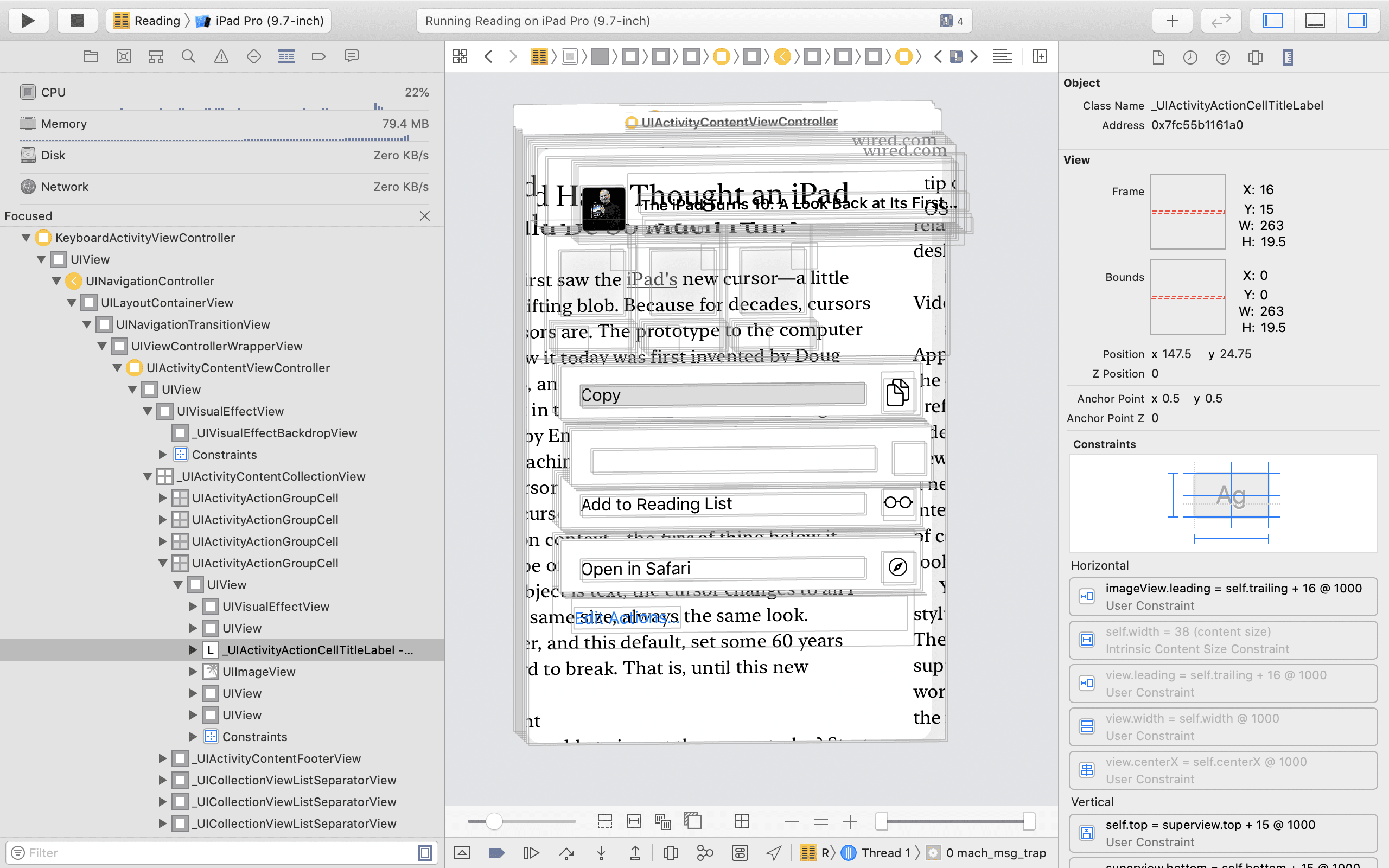
One useful thing I learned at WWDC 2019 was that the share sheet is implemented partially in the app’s process and partially as a remote view. Anything that could be a privacy risk such as seeing the names of other installed apps is handled by the remote view. The layout is driven in the app’s process so customising it works fine. The view debugger shows that the same views are in place for every cell, but some images and labels are empty:
I spent a while in the view debugger and learned what I needed to:
- The internal UIKit view class used for each row in the contextual menus is
_UIContextMenuActionViewand for the share sheet it’sUIActivityActionGroupCell. - I worked out how those views lay out their subviews. They both use layout constraints in a mostly straightforward way.
For example here is the view hierarchy of a _UIContextMenuActionView with an image:
ContextMenuActionView
|  StackView; frame = (16 13; 59 25.5)
|  |  Label; frame = (0 0; 59 25.5)
|  ImageView; frame = (82 11.5; 23 26)
The horizontal constraints are:
H:|-(16)-[StackView] (names: '|':ContextMenuActionView)
StackView.trailing <= ImageView.centerX - 18.25
ImageView.centerX == ContextMenuActionView.trailing - 30.25
What I wanted to do is change these three constraints to basically flip the horizontal order of image and label.
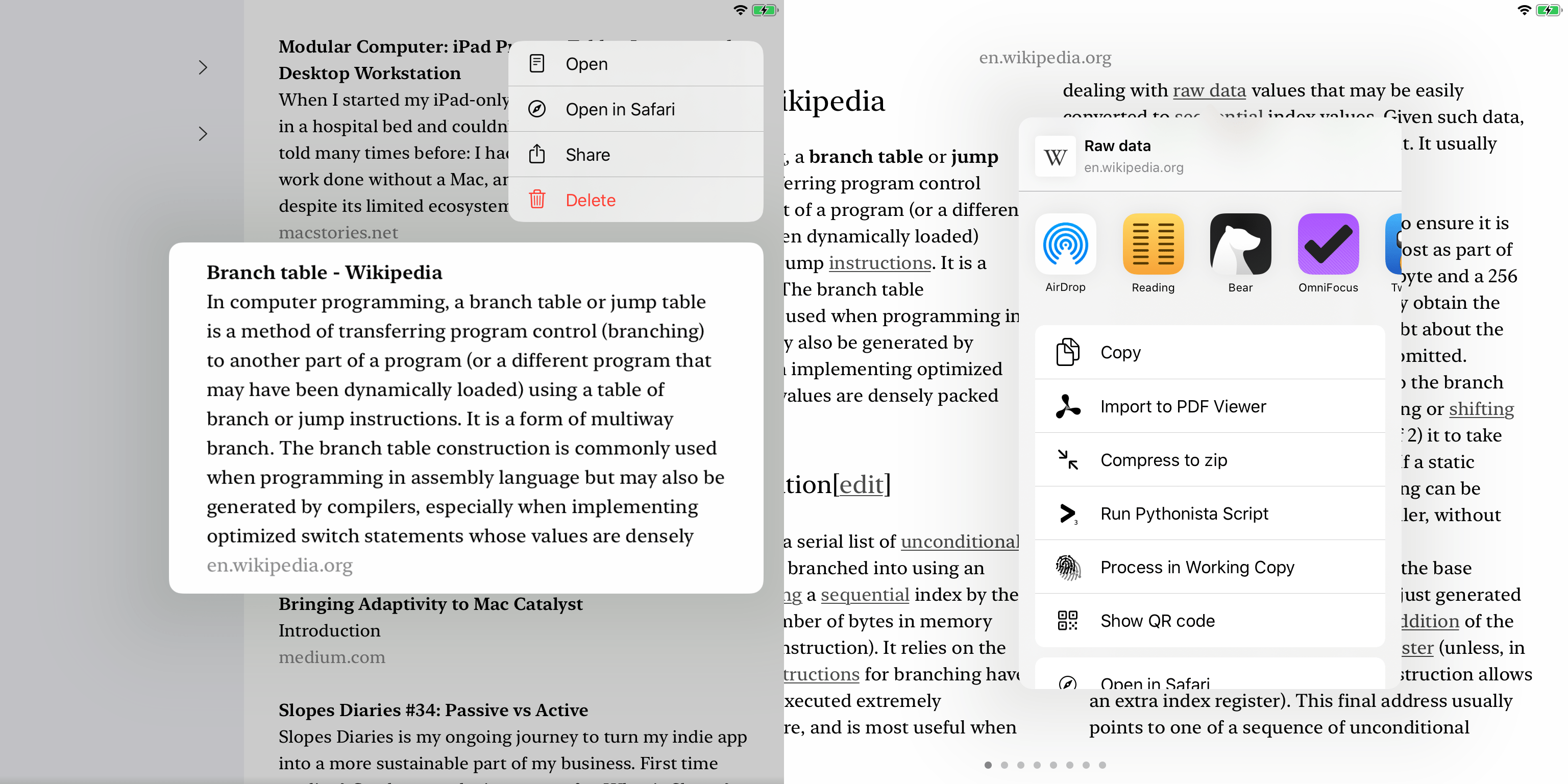
I was able to implement an improvement for the layout by swizzling updateConstraints on _UIContextMenuActionView and UIActivityActionGroupCell. The method swizzle deactivates a few horizontal layout constraints and replaces them with the desired constraints. Perhaps slightly surprisingly, it works really well. (Tap to toggle to the original image.)
- The code is well commented with the expected view hierarchy and constraints.
- Tested with Dynamic Type
- Tested with right-to-left layouts.
- Handles the cases with or without images.
- Checks if the desired constraints are already in place.
- Checks that the view hierarchy is as expected.
- Checks that the original constraints are as expected.
- Any failures to apply the enhancement are reported using the
errorHandlerparameter so the app decides what to do.
Try it out
Update: The view hierarchy changed and the technique described here unfortunately doesn’t work on iOS 15 and later.
If you want to improve the menus in your app, all you need to do is:
- Add MenuAlignment.swift to your target. You also either need Swizzling.h and Swizzling.m from that Gist (and expose in your bridging header), or you need to replace the calls to
swizzleVoidVoidMethodwith your own swizzling helper. - Call
applyMenuAlignmentSwizzles(errorHandler:)to apply the enhancement at some pointer before showing a contextual menu or the share sheet. - Be aware that this is using private API and consider the risks with iOS updates and app review that this entails.
You can find the full code in MenuAlignment.swift or try it out in my reading app.