Douglas Hill’s posts in 2010
1 March 2010
When you use an application as much as I use Instapaper, small changes can make a big difference. Here are assorted thoughts on the 2.2 update. »
2 March 2010
9 March 2010
Bugfix update 2.2.1 now in App Store »
10 March 2010
Apple’s Jobs confirms iPhone ‘kill switch’ — Telegraph:
Phone differentiation used to be about radios and antennas and things like that,” Mr Jobs told the Wall Street Journal. “We think, going forward, the phone of the future will be differentiated by software.
From August 2008, soon after the launch of Apple’s app store. To me, this is so obvious now. I wonder if it wasn't obvious back in 2008?
(Regarding the ‘kill switch’: I'm not aware that it has ever been used.) »
24 March 2010
it's now possible to bring up the services panel for every link in the article
Terrific!
This will fix ‘the Daring Fireball problem’, which is when there is an item on the linked list with lots of additional commentary or other links that I want to send to Instapaper. This is missed out with the current ‘send to Instapaper’ in NetNewsWire and Reeder as DF Linked List article links in the feed point to the original article. »
25 March 2010
It's beginning. »
Apple a force to be reckoned with in portable gaming »
26 March 2010
History of my use of Web Browsers »
27 March 2010
Opera Mini 5 on the Google Nexus One:
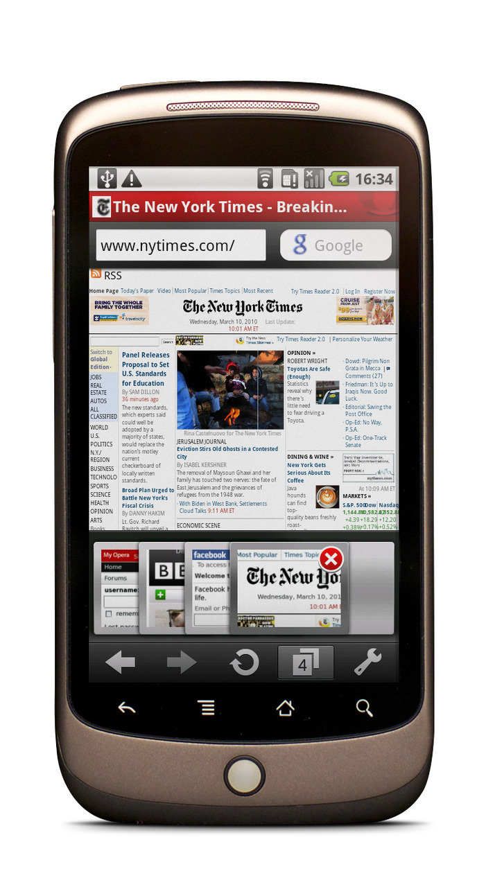
It looks a bit odd having two back buttons right on top of each other. This showcases a problem for cross-platform applications: should Opera Mini for Android look and act like Opera Mini or should it fit in with Android? I think Opera Software tends to place more importance on cross-platform consistency than I would. However, I do only use the Mac and the iPhone so my opinion is not balanced. »
Tumblr Theme
I am still working on the appearance of these pages and leaning how about making Tumblr Themes.
The current theme is a good starting point, but I want to work out what all the bits in the source do and take out everything not in use. »
29 March 2010
Marco Arment: Logarithmic calendar view »
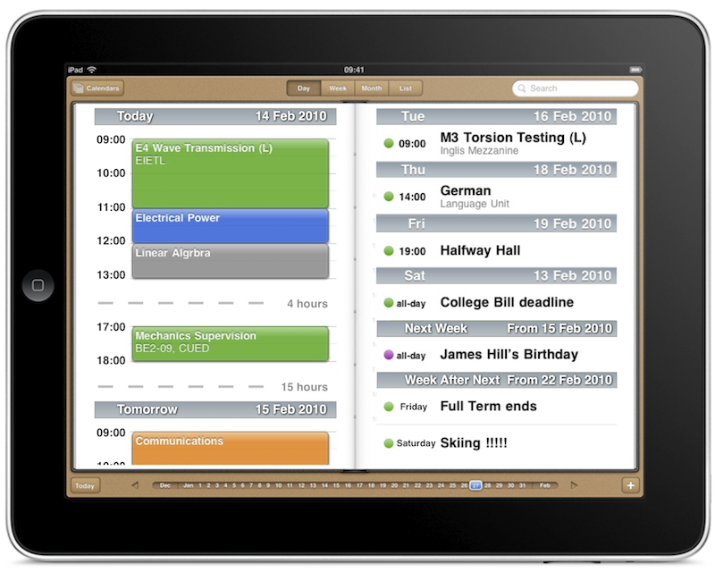
More on Marco Arment’s Logarithmic calendar view. Also see my previous post.
I spent too much time making this crude mockup. No, it isn't lined up properly and, no, it doesn’t make sense because the dates do not all match up and that birthday is not really where the pictures say it is. This is not important for now.
The general idea is:
- Today and tomorrow on the left in iPhone style day view. I pinched the idea of compressing free time from Palm’s WebOS — this is not fundamental to the idea.
- Future on the right in iPhone style list view. I’m trying to show only the one main event for each of the next few days and then the main events of the next couple of weeks in the lower right.
The iPad’s Calendar application is a good start as it has a split view. From what I can tell, it shows the same information twice in day view, which is rather puzzling. »
I’ve been thinking about the iPad’s calendar… »
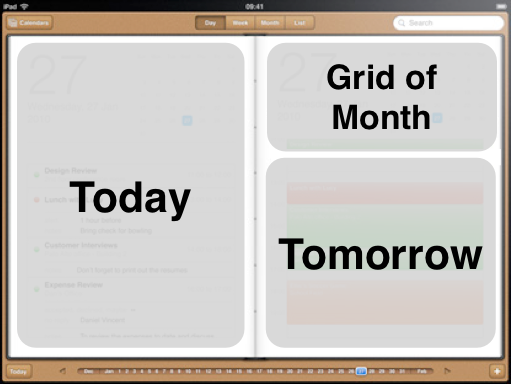
Here is another idea: in day view show today on the left and tomorrow on the right with a month grid to show you where you are in the month. This view is not for looking at any day you like: only today and tomorrow. A decent view of what is happening on future days is available in week view.
I like this view better than the mix up view I made earlier. Switching views is not a problem. Rather than trying to cram everything into one logarithmic view, I think it would be better to have this day view for the immediate future and week or month views for getting an overview of the more distant future.
I think this would work for me. I regularly check what is happening for the rest of today and tomorrow morning using day view on my iPhone.
I have a feeling all these ideas will have occurred to Apple’s designers, but were rejected. What have they found out that I do not know?
»

Some interface commentary:
The iPad contacts app takes the right hand side from the Mac’s Address Book where we have mouse hover feedback. There is no hovering on the iPad. I might be wrong, but I don’t think the blue tint was there on the emails and addresses in earlier screen shots so I think Apple have given this some thought. Do you think the tint is enough to show these items are tappable or should these items be buttons or underlined as links?
(Phone numbers are not tappable on the iPad, of course.)
1 April 2010
The bottom line is that the iPad has been designed and built by a bunch of perfectionists. If you like the concept, you’ll love the machine.
The only question is: Do you like the concept?
Just to be clear, I love the concept. »
2 April 2010

Nintendo are not doing very well from a web standards point of view…
From what I have picked up, Adobe Flash is still the most practical way to do animations on webpages. The problem here is that the big Flash item in the middle loads a static image and the others only have very simple animations. The page could easily be created with web standard technologies, which are generally better to use.
What’s this?
This is a screen shot of the the Nintendo UK and Ireland home page shown in Safari with ClickToFlash. »
Ignore the Code: iPad Springboard Breaks Spatiality »
Rotating to Landscape & Sideways Scrolling »
3 April 2010
Andy Ihnatko: iPad Accessories »

Bread maker: poor interface
True, it is not required to do anything particularly advanced but that does not mean there is no need to consider improvements. »
10 April 2010
iPhone OS 4 Developer Preview Event »
11 April 2010
My iPhone Background Processes List »
13 April 2010
iPad Web Browser with built in Google Search »
21 April 2010
Put This On, Episode 2: Shoes »
22 April 2010
Gizmodo and the Prototype iPhone »
24 April 2010
iPad and engineering textbooks »
30 April 2010
Pixelated missing plugin icon:

They should really be using SVG for this. »
1 May 2010
John Sullivan, the Free Software Foundation: »
5 May 2010
John Gruber on Michael Gartenberg on the iPad’s Early Success »
Follow-up on Safari’s Menubar »
6 May 2010
8 May 2010
Apple’s iPhone Background Processes List »
Lukas Mathis on the iPhone OS 4 Task Switcher »
Rapidly Switching Between iPhone Apps »
9 May 2010
iPhone OS 4 Task Switcher and Spatiality »
13 May 2010
Facebook’s Bewildering Tangle of Privacy Options
John Gruber:
Or you can manage it my way, by never having signed up for it.
It referring to Facebook.
That certainly would make some things simpler. »
The windows in Opera for Mac »
14 May 2010
New Beta Version of MobileMe Mail »
John Nack on Apple’s Control Over Native iPhone OS Software »
16 May 2010

Whatchamacallit?
The iPhone auto-correction amuses me sometimes.
I don't think I've ever typed that word before, so someone must have decided it was worth including in the dictionary. »
19 May 2010
20 May 2010
Mac OS X built-in Applications are Locked »
25 May 2010
Different Universe, Different Programming Preferences »
26 May 2010
AppleScript to Wrap Text in Quotation Marks »
27 May 2010
John Gruber on Chrome's Dictionary Extension »
30 May 2010
I only use the Google Reader web interface to check my trends once every so often.
Here is my list of feed obscurity (subscriber numbers).

Woo! Nobody is subscribed to my own Tumblr except me. I don’t mind since I am writing for myself rather than others.
Ars Technica Infinite Loop has only one subscriber as it is a personal URL for my full text feed. (I pay money.)
This is interesting: Marco Arment and Lukas Mathis (ignore the code) have the same number of subscribers to within 0.04%. I don’t know what to make of that other than it is a strange coincidence.
As always Daring Fireball has crazy numbers of subscribers. This is just Google Reader subscribers; this does not include direct feed access, the Twitter feed and the normal website. »
Why so few news feeds?
Exam term.
I cut down from 53 to 5 at the start of term. I quite like it this way. »
2 June 2010
Paul Thurrott: ‘Understanding iPad’ »
Jim Ray: ‘Understanding Paul Thurrott’ »
Steve Jobs at the D8 Conference »
3 June 2010
Daring Fireball: AT&T’s New Data Plans »
Skinning the frog - iPad definitely a threat to Windows »
5 June 2010
Another Simple Service: List Sorting »
Deleting from the iPhone Home Screen »
10 June 2010
iPhone Multitasking and Background Updating »
11 June 2010
Duncan Wilcox on content creation on the iPad
Objects and actions are pleasingly orthogonal to the mathematically inclined
Certianly are. I think this distinction is what makes Quicksilver so appealing to me. »
12 June 2010
Resolving the iPhone 4 Resolution
The ability to see two sources very close together is called resolution. It’s measured as an angle
This is an important definition from a great article. I love technical articles like this. »
Daring Fireball: Obsession Times Voice
…the notion that blogging is a meaningful verb. It is not. The verb is writing. The format and medium are new, but the craft is ancient.
John Gruber
Old post found via Marco Arment »
16 June 2010
17 June 2010
28 June 2010
John Gruber on the Oddest Point of the WWDC Keynote: Farmville »
1 July 2010
Early Impressions of iOS 4 Performance on my iPhone 3G »
The Bullet on the iOS 4 Keyboard »
15 July 2010
Moving Email Messages Between Accounts on iOS 4 »
16 July 2010
The Holy Grail Of Ubiquitous Plain-Text Capture | Lifehacker Australia »
Are You Using a Broken Tool? | Bridging the Nerd Gap »
17 July 2010
Looks, Physical Design and Technical Advantages »
20 July 2010
Ars Technica: Apple responds to Congress, swears location data is private »
23 July 2010
YouTube — iOS 4.0 on iPhone 3G
It’s a lot funnier if you have an iPhone 3GS or 4.
It is funny, but for me it's funny because it's true. That Safari performance is very typical. »
26 July 2010
Reeder for iPhone takes on the iPad style
The latest version of Reeder for iPhone uses the black rather than light status bar, with rounded corners on the navigation bar just like the iPad. This style suits Reeder very well. »
27 July 2010
Apple releases a trackpad for desktop Macs, and then there are people like me who buy mice to use with MacBooks. Is the choice good? I really don’t know; I find mice so much better for moving the cursor compared to trackpads. »
Minimal Mac: Of Mice and Magic »
28 July 2010
Using a phone for an unrelated task when talking to someone is rude.
It is also inefficient multitasking. »
29 July 2010
Old Article: John Gruber’s iPhone 4 Review »
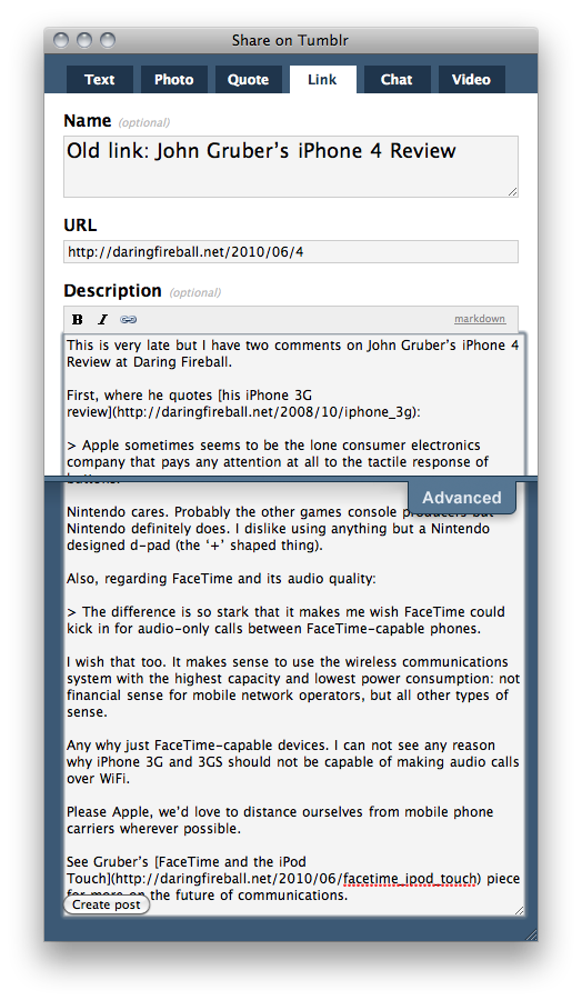
Safari’s resizable textareas are good, but sometime go wrong. Here is the post to Tumblr bookmarklet’s window. »
More on Avoiding Mobile Carriers »
Desktop:
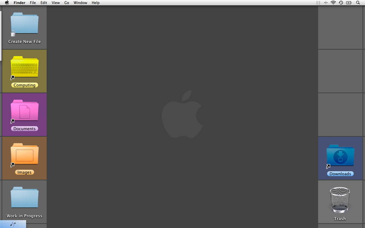
Not designed in isolation from the rest of the system. »
Marco Arment: The Kindle update »

Hooray: YouTube videos straight out of articles in Instapaper. I don't know if this is deliberate, but it is a grand success for the Instapaper HTML parser.
The article is from Tested and about Microsoft Research's Street Slide and I found it via Lukas Mathis on Ignore the Code. »
30 July 2010
Ars: Apple looking into slow iOS 4 performance on iPhone 3G »
1 August 2010
14 August 2010
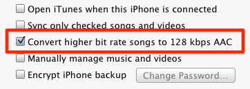
This iPhone/iPod sync option is new to a recent version of iTunes. It’s incredibly useful and helps cram a lot more music into a device’s limited space, especially if you have a lot of high-bitrate songs.
It’s strange when you download music on the device then connect it with iTunes. The data transfers from the device up to iTunes at full quality then is converted to 128 kb/s and sent back. This makes sense, but just seems a bit odd.
(Reblogged from Marco Arment) »
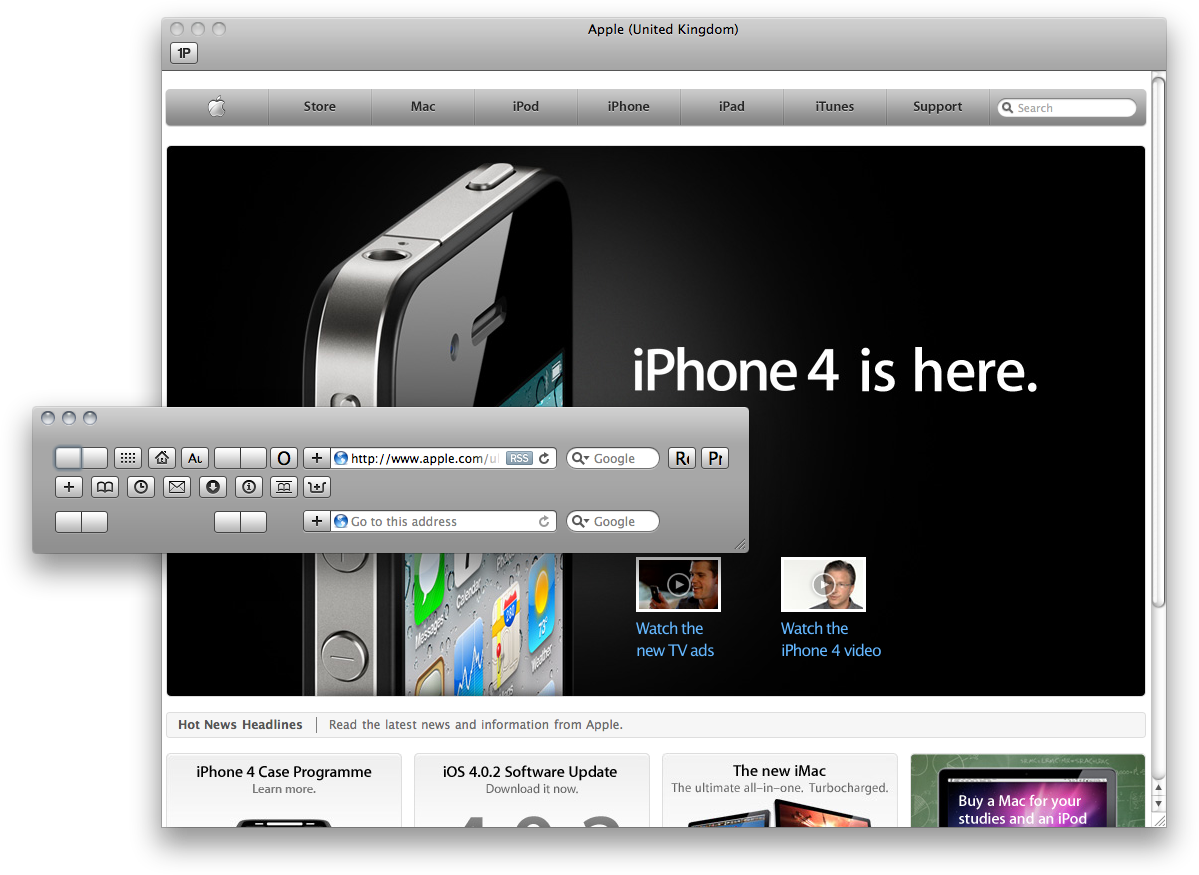
This is what happens when I press command-L to bring up the Safari toolbar. It shows only 1Password in the real toolbar and makes this crazy toolbar window containing everything else. Sometimes I love bugs.
I normally go without a toolbar. »
17 August 2010
Safari Knows About Its Open Pages »
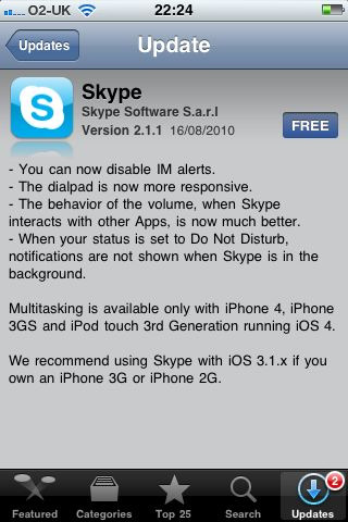
Skype recommends iOS 3.
That's just great. The version of the OS I am using (the latest) is not recommended for my hardware (iPhone 3G). »
19 August 2010

The latest version of Soulver for iPhone (1.1) is a really nice upgrade to the best iPhone calculation tool.
Reading the release notes, I was thinking 'how does the interface work for all these new features?' The answer is 'so slickly I wouldn't have believed it possible'. Everything just fits in and feels right.
Time will tell, but I still doubt this will replace my Casio for 'real work'. Soulver is the best software only calculator though. »
I caught a wasp dismembering and beheading a fly. I love the way the wing jumps towards the camera when torn off.
- 32 seconds
- Shot with a Canon Digital Ixus 80 IS
- Quality reduced for web
- No audio (removed)
- Apologies for not setting the camera to macro focus and moving it right close. That might have disturbed the wasp. »

I made a smoothie. Smoothies are delicious and healthy, although time-consuming to make.
Ingredients
- ring of pineapple about 20 mm thick
- two thirds of a banana
- some Tropicana orange juice (maybe about 200 ml)
Blended until smooth, this made about 400 ml which was slightly too much for this glass.
This is close to as simple as a smoothie can get. The taste is good though so I recommend this recipe. Don’t add too much banana or it dominates, and try to avoid blending pineapple seeds as they’re very bitter. »
that canadian girl » Three Reasons Why the Mac Community Makes Me Happy »
20 August 2010
21 August 2010
Is Microsoft Office really the right tool? »
25 August 2010
iOS 4 Feature Removal: iTunes Background Audio »
27 August 2010
Tumblr Theme
I’ve been looking over my Tumblr theme this evening. It does not look much different, but I took out a lot of redundant CSS and made a few modifications here and there. The post titles still don’t look right on iPhone.
I am learning how this stuff works as I go along. »
Minimal Mac: What's in your Simplenote? »
28 August 2010
Question Mark in Facebook Interface »
1 September 2010
2 September 2010
Answers to my Questions in Wi iTV »
9 September 2010
Facebook for iPhone’s Home Screen »
11 September 2010
21 September 2010
Guardian: Facebook fraud a ‘major issue’ »
23 September 2010
Fun with ad-hoc bathroom signage
Some very good fun. Marco is the best. I love the closing sentence.
(Reblogged from Marco Arment) »
24 September 2010
Accessibly Irony with the iPad-Optimised iOS Reference Library »
BBC News — Nuclear power at heart of Russia’s Arctic ambition »
26 September 2010
I made this website's layout react to your browser window's width. If you play with the resize handle, you'll figure out what that means it if you haven't already. If nothing happens, download and use a modern browser. Blondes will smile at you in the street. It's very heartwarming, you'll see. »
1 October 2010
2010 Gadget Census — The IET »
5 October 2010
6 October 2010
Sony's Google TV controller outed on ABC's Nightline (Engadget):

This is a funny joke. Ha ha.
(Engadget piece found via Daring Fireball) »
9 October 2010
My Trash ‘Application’ and Aliases »
10 October 2010
Seven Steps to Mastering Your Web Browser »
12 October 2010
13 October 2010
26 October 2010
Jason Kottke does some interesting calculations »
29 October 2010
Devin Graham on YouTube: Huge Bike Jump into a Pond 35 feet in the air
Amazing quality. The whole thing is like a well shot photograph. Looks fun too.
I thought it was going to be too long, but it was so gorgeous I was hooked.
Via Alan (through Facebook). He’s a super great guy to know. »
What is Amazon's approach to product development and product management? (Quora) »
Neven Mrgan: Black Menu Bars in Lion:
A suggestion for Mac OS X Lion: since the team is trying to integrate the menubar into the desktop a bit more, to make it less prominent - the translucent menubar was an attempt at just this - why not go all the way and make it black? This way, it’ll blend into the bezel of (most) new Macs.

Looks like iPad. Looks good.
(via Minimal Mac)
(Reblogged from Neven Mrgan's tumbl) »
30 October 2010
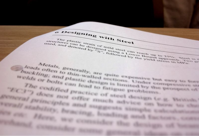
Designing with Steel. That's what it's all about.
Photo edited with Pastebot and TiltShift Generator. »
1 November 2010
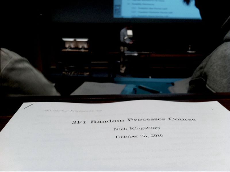
In part two of the lecture handout titles series, we see that I'm actually going to a lecture course in random stuff. »
3 November 2010
Lawsuit: Apple turned iPhone 3Gs into “iBricks” to boost iPhone 4 »
4 November 2010
Camera doesn't Task Complete »
View PDFs in Chrome | Mac OS X Hints | Macworld »
The Macalope Weekly: Gates! (Macworld) »
6 November 2010

Yesterday was November the fifth: fireworks night! Also known as Guy Fawkes Night. (Wikipedia)
I took this with with my iPhone 4 with HDR mode on. I like the tree: it adds more interest to the shot. The location is Midsummer Common, Cambridge. (Google Maps) »
Speed of Returning to the Home Screen on iPhone 3G and iPhone 4 »
7 November 2010
See this video of a fast running goal keeper. (YouTube link)
Jason Kottke describes it well:
He's moving so comically fast compared to the other players on the pitch that it reminds me of the not-so-special effect of Clark Kent racing the train in Superman.
If all football was like this, I’d watch it a lot. (I don’t watch it at all.) »
10 November 2010
US Navy Sea Water Antenna System »
11 November 2010
There is a reason Hermione seems much more intelligent than Ron Weasley. It’s because Ron is very likely completely uneducated. »
14 November 2010
Compare Many Photos in iPhoto »
15 November 2010
16 November 2010
19 November 2010
Automatic State Saving in Lion »
20 November 2010
Arial:

Not a pretty picture, but I couldn’t resist altering this to state it's typeface.
Shot, edited and posted with my iPhone. Edited with Adobe Ideas and Pastebot.
I couldn't think of a way to move the ‘A’ over on my iPhone. If there's not an app that can do this already, I bet there will be soon. »
23 November 2010
Why does this need to be scrollable?
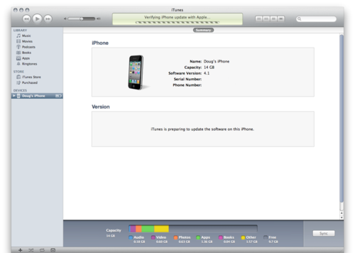
I feel that iTunes is unloved. »
27 November 2010
Google have made some tremendous enhancements to the search results page in the last couple of weeks.
I recently noticed the arrow on the left side of the results. What this means is keyboard navigation. This is so satisfying to use. Up and down on the arrow keys to go up and down, of course. Right arrow to bring up the lovely page preview, which is great for peeking when you’re not quite certain a page is what you want. Hit return to follow a result. I use this when I forget to do an ‘I’m feeling lucky’: just press return as soon as the results page loads to go to the top hit.
I just noticed Google Instant has ‘rolled out’ to me now. It’s really fast. Google feels like a power-tool, and yet I don’t think it is too complex to be difficult to use. They’re really good at this. »
28 November 2010
These never get old
(Reblogged from Uncommon Nonsense) »
1 December 2010

Well, this is my first shot shared with Instagram. I decided to try out Instagram on the recommendation of Rands. While the concept of the service seemed strange to me, it does make sense now: make it really easy to make photos looks great and share them. I must say they seem to have done a superb job on making the filters great.
Let’s see if Instagram can stand the test of time.
Update: 9 April 2012 — today Facebook bought Instagram, and I decided to delete my account because I wasn't using the service anyway. »
4 December 2010
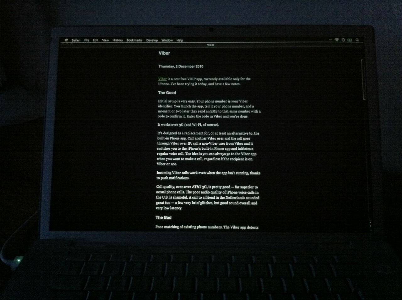
Dark Mode in Instapaper ‘for Mac’.
Enable this with the keyboard shortcut specified under Universal Access in Keyboard Shortcuts in System Preferences. Look for ‘Reverse black and white’.
Of course, I prefer reading in Instapaper on my iPhone but, for some reason, this article (Daring Fireball: Viber) would not load in the app. »
Bringing iOS to the Desktop: Why You Should Get Excited | Mac.AppStorm »
5 December 2010
Remiel: Making the leap to SSD:
Not only does my Mac now “just work”, it “just works NOW”.
ignore the code: Saving Documents by Proxy
Lukas Mathis discusses the benefits of saving files by dragging to a destination already on screen. Worth a look.
I mocked up this this idea about a month ago:
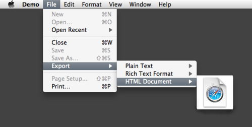
It’s a static image; there is no working code. The principle is that you drag an icon out of the menu bar to a folder that is already open. Lukas points out that the destination could even be an FTP application. »
9 December 2010
Apple - iPhone - Tips and Tricks »
10 December 2010
Some Thoughts on the Instapaper App’s Interface »
13 December 2010
The Brooks Review: On Caps Lock »
14 December 2010
(Video missing)
lkm:
OMG. This seems to be an actual game. Via listentothebit.
This brings together so much of what I love. So happy watching this (although it’s a bit too long).
(Reblogged from lkm and Listen To The Bit) »
From Ars Technica:
For instance, users that have jailbroken iPhones would like to have a modified version of iTunes that does not ask to update iOS when the device is plugged in, since the update might overwrite jailbreak modifications," Freeman said.
Try these:
- iTunes > Preferences > General > Check for new software updates automatically — OFF
- iTunes > Preferences > Devices > Prevent iPods, iPhones, and iPads from syncing automatically — ON
No system hack necessary.
Another thought: We don’t normally include the serial comma in British English (the one before the ‘and’ in the second path above). Should localisation take conventions such as this into account? »
15 December 2010
Tip: run Pastebot in the background when putting together a blog post on an iPhone. Pastebot can run for ten minutes in the background. Periodically copy the whole post, just in case something bad happens. (For example, an app gets pushed out of memory and does not implement full state saving.) »
18 December 2010
21 December 2010
Despite chaos in out postal system due to all the snow, my Glif arrived today — on schedule. Rock steady cat movies are the order of the day. »
22 December 2010
Accessibility for iPhone and iPad Apps — Matt Legend Gemmell
All iOS developers should read this. As Marco Arment says: “Excellent VoiceOver UI is extremely little effort that yields massive improvements for many people.”
(Reblogged from Marco Arment) »
Merlin Mann: It is done. Adieu, Quicksilver. »
23 December 2010

We had a terrific frost the night before I left Cambridge — which was a few weeks ago now. The ground was already whitened late in the evening. I had never seen frost like that before.
I nearly froze my hands off taking photos in the morning — my iPhone is my camera so gloves were out of the question. Picking a best one to share here was tricky. This one is beautiful; it’s a clear example of the benefit of turning the flash on when outside in daylight. »
Reeder and the Keyboard — Shawn Blanc »
24 December 2010

Christmas Day TV (Taken with instagram) »
Apple’s Christmas present to me: a firmware update for my Time Capsule. How lovely. »
27 December 2010
‘Byron G’, in an article on batteries:
Be warned, however, that repeated bump charging will wear your battery faster and begin to reduce its capacity. If you are a “power user” who will buy a new battery a few months from now anyway, this presumably isn’t a concern.
Pun intended? »
28 December 2010
The Mighty Eagle Soars — The Brooks Review »
Adobe Loves Web Standards

Supposed to be an SVG example. Screen shot taken from Safari. Is Webkit’s own SVG rendering not good enough? »
29 December 2010
This video tries to explain Scribblenauts in Japanese. For me, this guarantees it's hilarious and I'm left clueless.
(Owning Scribblenauts doesn't seem to help me understand what’s going on in this video.)
(Reblogged from Tiny Cartridge 3DS) »
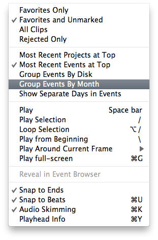
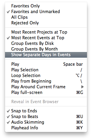
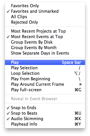
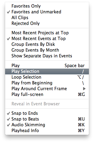
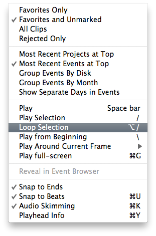
I caught you out iMovie developers. You know what they say about using system provided controls… »
InstaFavor — The Brooks Review »
30 December 2010
System Preferences iOSification
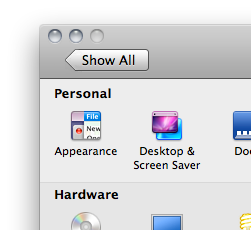
Maybe System Preferences will look like this in Mac OS X Lion.
For reference, here is what it currently looks like:
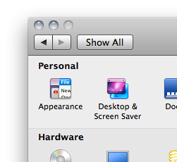
I never use the Back or Forwards buttons. I think Show All is all that is necessary. »


